
If you have ever paused in front of our online shop feeling a bit undecided about which jar to pick, you are not alone. Choosing a honey is a bit like choosing a fine wine; each one tells a story of the North London garden or woodland where it was made. Since we can’t hand you a tasting spoon through your computer screen just yet, we have introduced something rather special to help you decide.
We are now using sensory radar charts for every honey we sell. These clever little diagrams show you exactly what to expect before you even twist the lid. Simply put, the higher the “spike” on the chart, the more intense that specific quality is. Whether you are looking for something to soothe a scratchy throat or a bold treat for your morning toast, these charts are your new best friend.
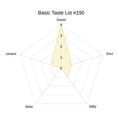
1. Understanding the Basic Taste Chart
The first chart you will see focuses on the five basic tastes: sweet, sour, salty, bitter, and umami. While all honey has elements of each, the balance can vary surprisingly! For instance, a honey from the lime trees in Highgate might have a refreshing hint of acidity, whereas a late-season forage might show a tiny, sophisticated spike of bitterness.
By looking at this chart, you can immediately spot which honeys are “Sweetness Superstars” and which offer a more complex, savoury profile. It takes the guesswork out of the equation. If you prefer a very traditional, sugary profile for baking, you’ll want a chart with a high sweet spike. If you like something more nuanced to pair with cheese, look for those interesting variations in saltiness or acidity.
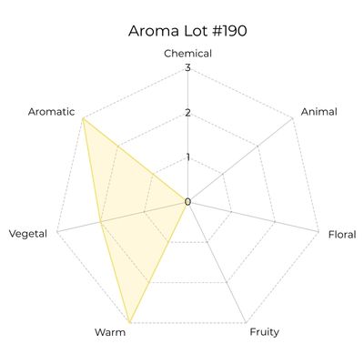
2. Discovering the Aroma Profile
Aroma is what you perceive inside your mouth while you are actually eating the honey. Have you ever noticed how some honey feels “warm” or “floral” the moment it hits your tongue? That is the aroma at work! Our second radar chart maps out these sensations, ranging from delicate flowery notes to deep, woody undertones.
For those who often ask me for an “aromatic” honey, you can now look for a prominent spike in that category on the chart. It’s a wonderful way to explore the diversity of our local North London nectar.
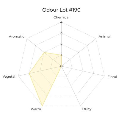
3. Exploring the Odour of the Hive
The third chart is all about the “nose”—the scent you get when you first open the jar. Odour is a huge part of the sensory experience. Some of our honeys, like those from the Sweet Chestnut trees, have an intense, almost musky scent that fills the room, while others are as light and fleeting as a spring morning in Hampstead Heath.
Using this chart, you can find a honey that appeals to your senses from the very first sniff. If you love a “heavenly scent,” you might look for jars with high spikes in the floral odour category, often influenced by nearby Mock Orange or Abelia bushes. It turns your daily spoonful of honey into a full sensory ritual.
4. Comparing Different North London Postcodes
One of the most authentic things about urban beekeeping is that honey from Finchley can taste quite different from honey gathered near Epping Forest. Because we only sell honey from our own hives, these radar charts allow you to “travel” across our hive locations through your palate.
You might find that our Welsh Harp reservoir honey has a completely different “spike” pattern than the honey from our Highgate gardens. It’s a bit of a masterclass in local geography! You can compare two jars side-by-side on your screen and see exactly how the local forage—from the lime trees to the wildflowers—has shaped the final flavour.
5. Finding the Perfect Match for Your Food
Our Londoner customers are often busy people who love quality food but are short on time. These charts act as a shortcut for food pairing. If you are making a salad dressing, a honey with a “sour” or “acidic” spike on the taste chart is a brilliant choice. If you’re drizzling it over yoghurt, you might want a more “floral” aroma.
Think of the radar charts as a guide for your kitchen adventures. Instead of opening three different jars to find the right one, you can glance at the spikes.
6. Education Without the Jargon
At Highgate Honey, we believe in keeping things simple. We know you’re busy, so we’ve avoided “wine-speak” and dense jargon. The radar charts are a visual, “bite-sized” way to learn about bee biology and the chemistry of nectar without needing a science degree.
Every spike on that chart represents thousands of flights by our bees to flowers like Clover, Hawthorn, or Ivy. By using these charts, you aren’t just buying a jar of honey; you’re becoming an expert on what our London bees are up to. It’s a simple, visual way to see the hard work of the hive reflected in the intensity of the flavour.
Conclusion
We are so excited for you to try this new way of shopping. These radar charts are the next best thing to sitting down with me for a tasting workshop! They offer clarity, honesty, and a little bit of fun as you navigate the wonderful world of North London honey.
Whether you are a seasoned honey connoisseur or a newcomer looking to soothe your hayfever, these charts will help you shop with confidence. If you’d like to see how the bees create these amazing flavours, why not have a look at our guide on 80 flowers for bees to see what might be blooming in your postcode?
Leave a Reply